DESIGN PACKAGING
SANOGYL
DENTAL CARE RANGE REVAMP
BRANDING, NAMING, GRAPHIC DESIGN, ADAPTATION, ICONS, MOTION.
Innovation has been the heart of this new project.
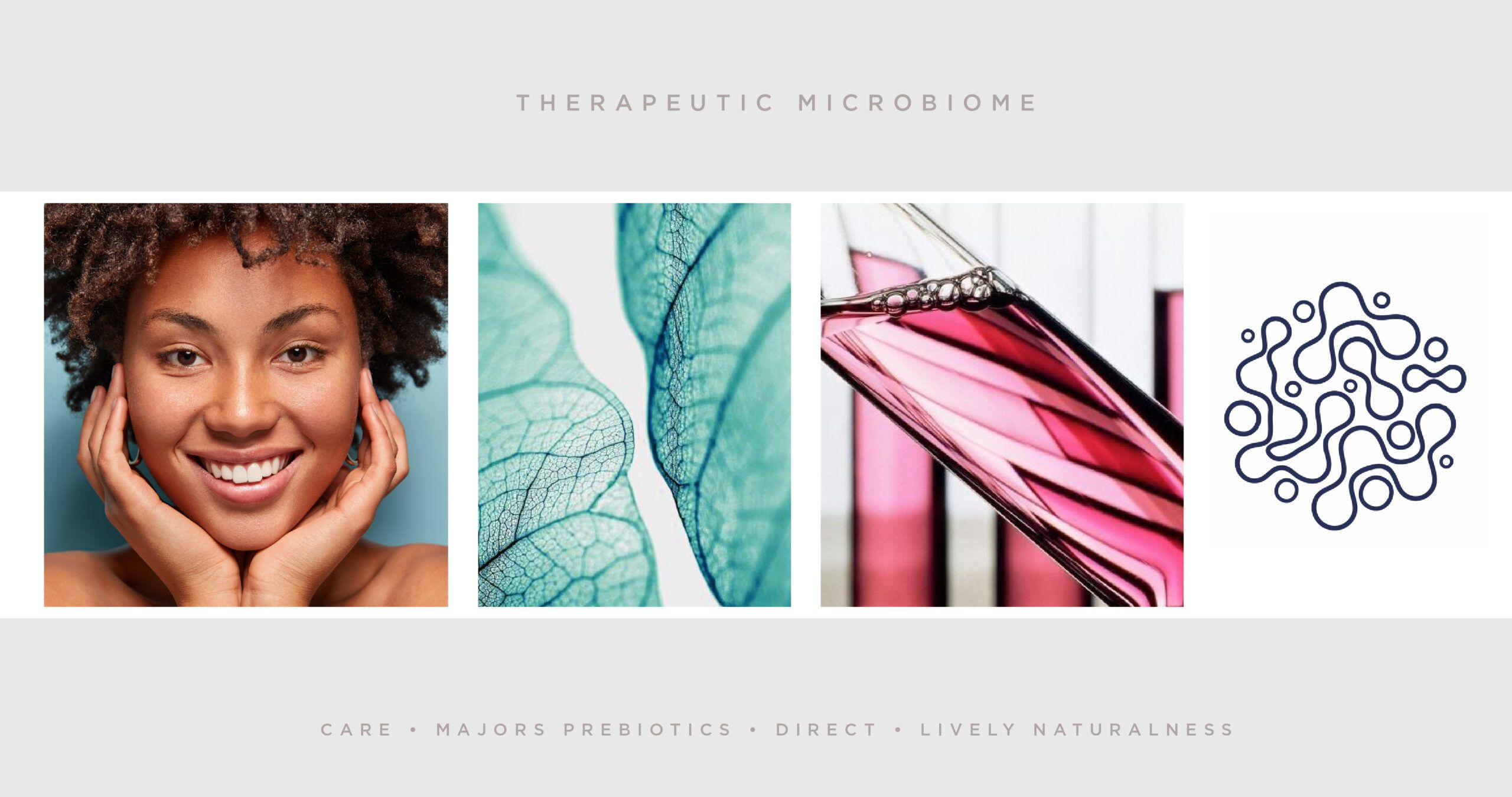
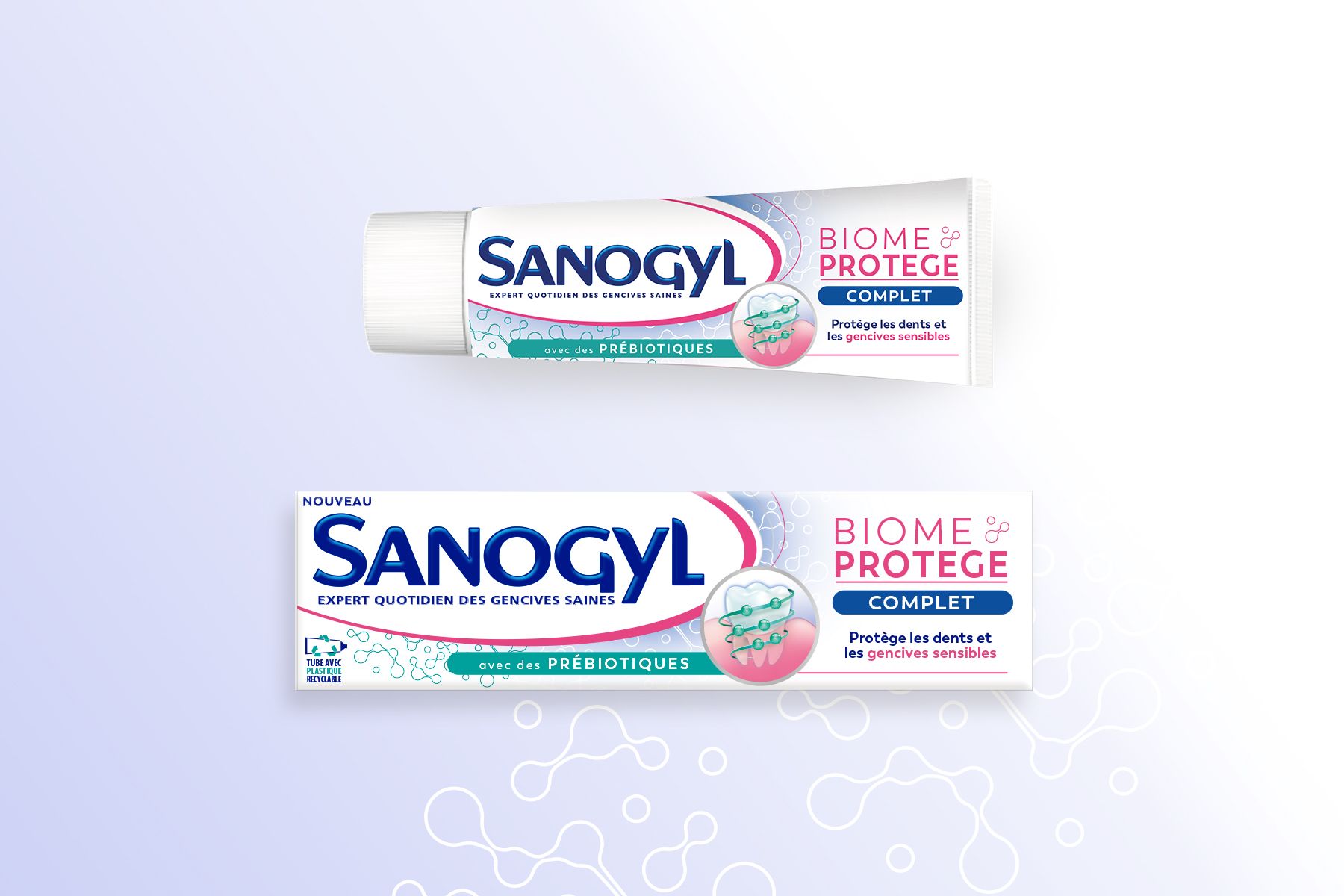
The objective was to replace the « Apaise & Renforce » range by a new dental care range on microbiome protection. Expressing expertise, naturalness & therapeutic microbiome were key objectives in our vision.
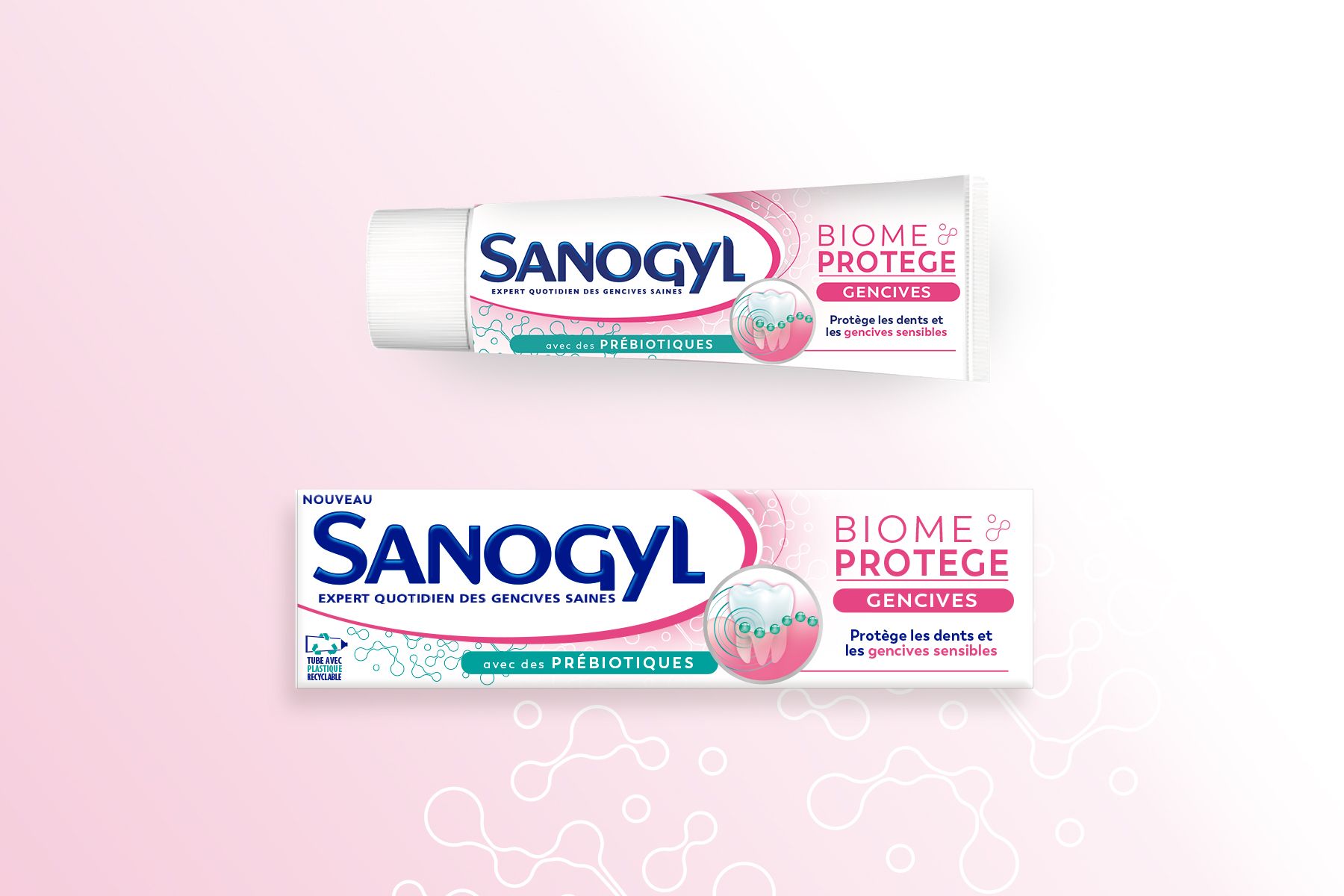
We created a scientific-friendly pink branding « Biome-Protège » with a microbiome pattern on packagings.
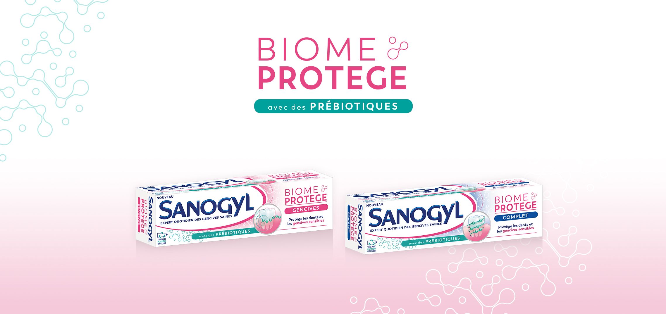
The pattern is green on the left side for naturalness and turns white on the right side for care.
In order to differenciate the 2 references, the pattern wears a pink (for "Gencives") or blue gradient (for "Complet") under the white part of the pattern. The green headband « with prebiotics » helps to enhance the specific innovation.
We emphasized on consistency by using the same design on the tube.
Back of packs where created in a didactic way, with clear specifications to really understand what is Microbiome & what are the benefits of it.
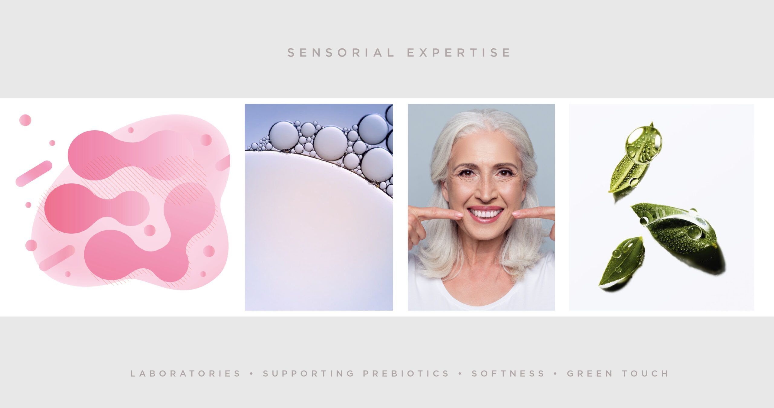
Thanks to the overall design, colors & graphic structures, the new range translates an expert but soft approach to stay in the care of the teeth.