BRAND REVAMP
MILTON
BABY HYGIENE & HOME BRAND REVAMP
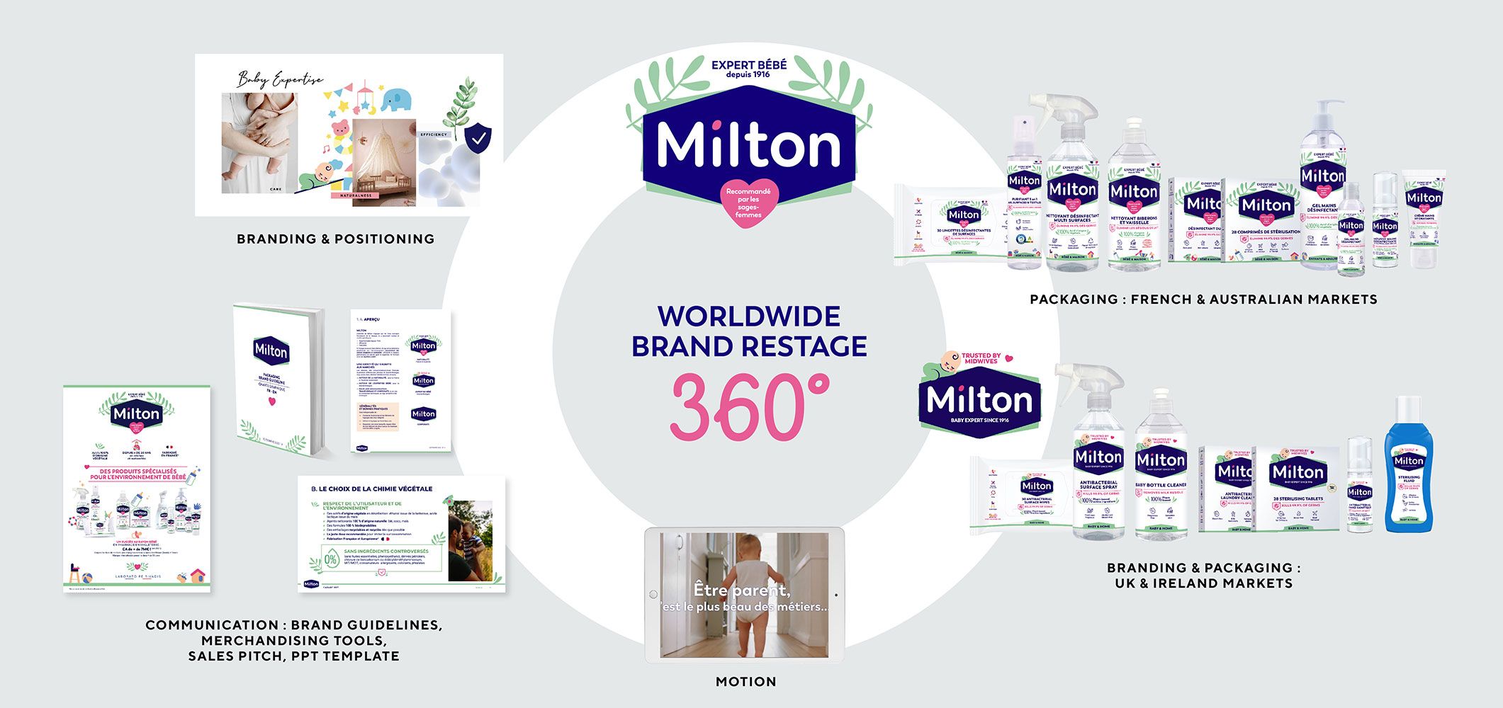
POSITIONING, BRANDING, GRAPHIC DESIGN, COMMUNICATION, MOTION, MERCHANDISING, ILLUSTRATIONS, ICONS, ADAPTATIONS, TEMPLATES, GUIDELINES
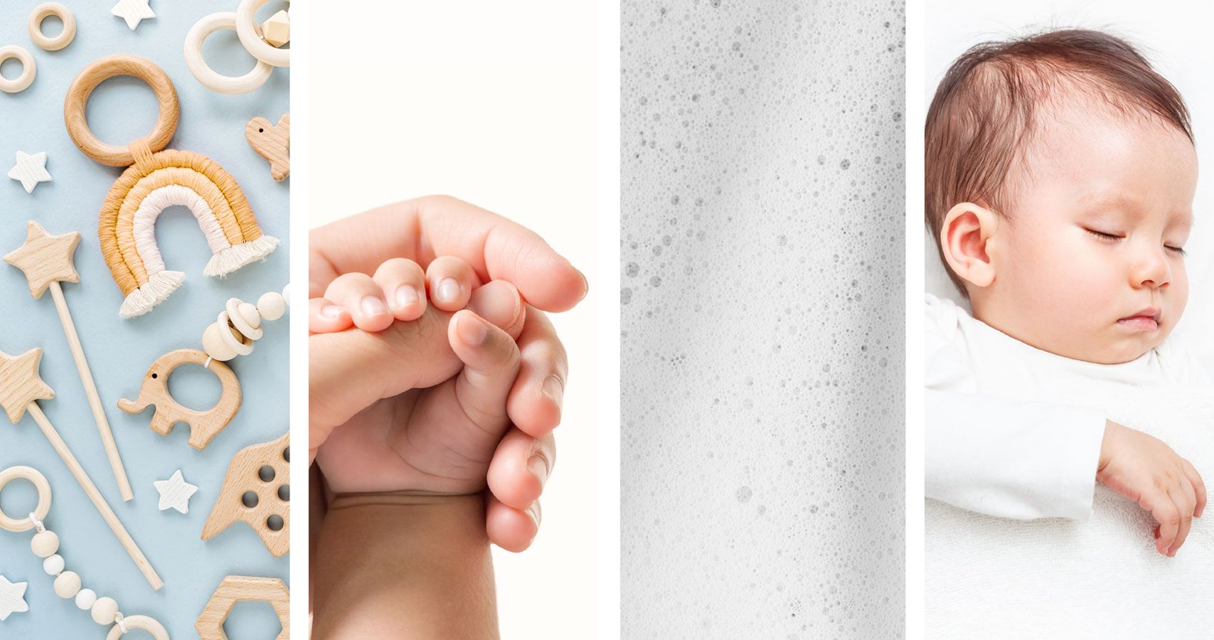
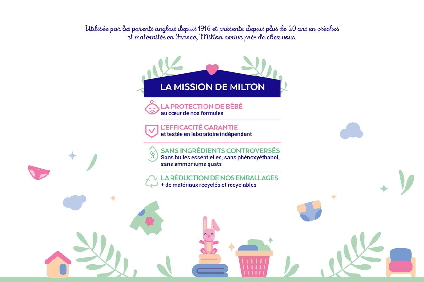
Milton is a baby expert brand in hygiene & disinfection, especially well known in the UK market. It is a been a baby specialist brand since 1916, used by professionals, very efficient in terms of protection against the germs and also natural, as it is coming from vegetal and mineral origins.
Our brand design mission was to seduce young consumers and energize consumer’s current loyalty in all international markets such as the UK, France, Ireland or Australia.
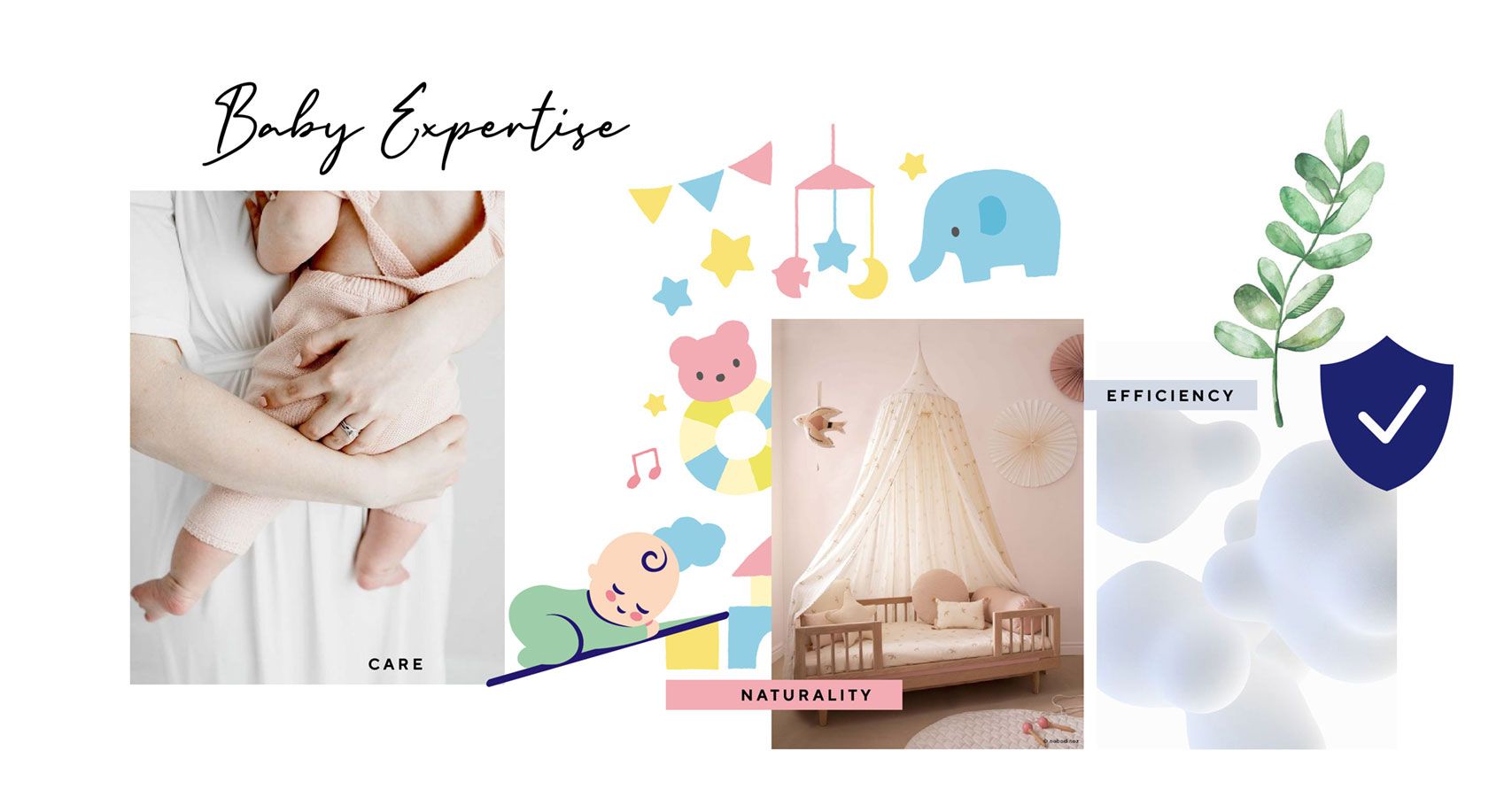
We were asked to reinforce Milton’s brand heritage through its efficiency and natural aspect into the baby category.
The positioning challenge was to find the right balance between baby expertise, naturality & efficiency in order to reinforce the trust of parents in using Milton’s products.
The main thinking was on the expression of this positioning through the branding & packaging first, and then on the traduction of the big idea through other ways of communication such as motion, merchandising, edition, templates and guidelines.
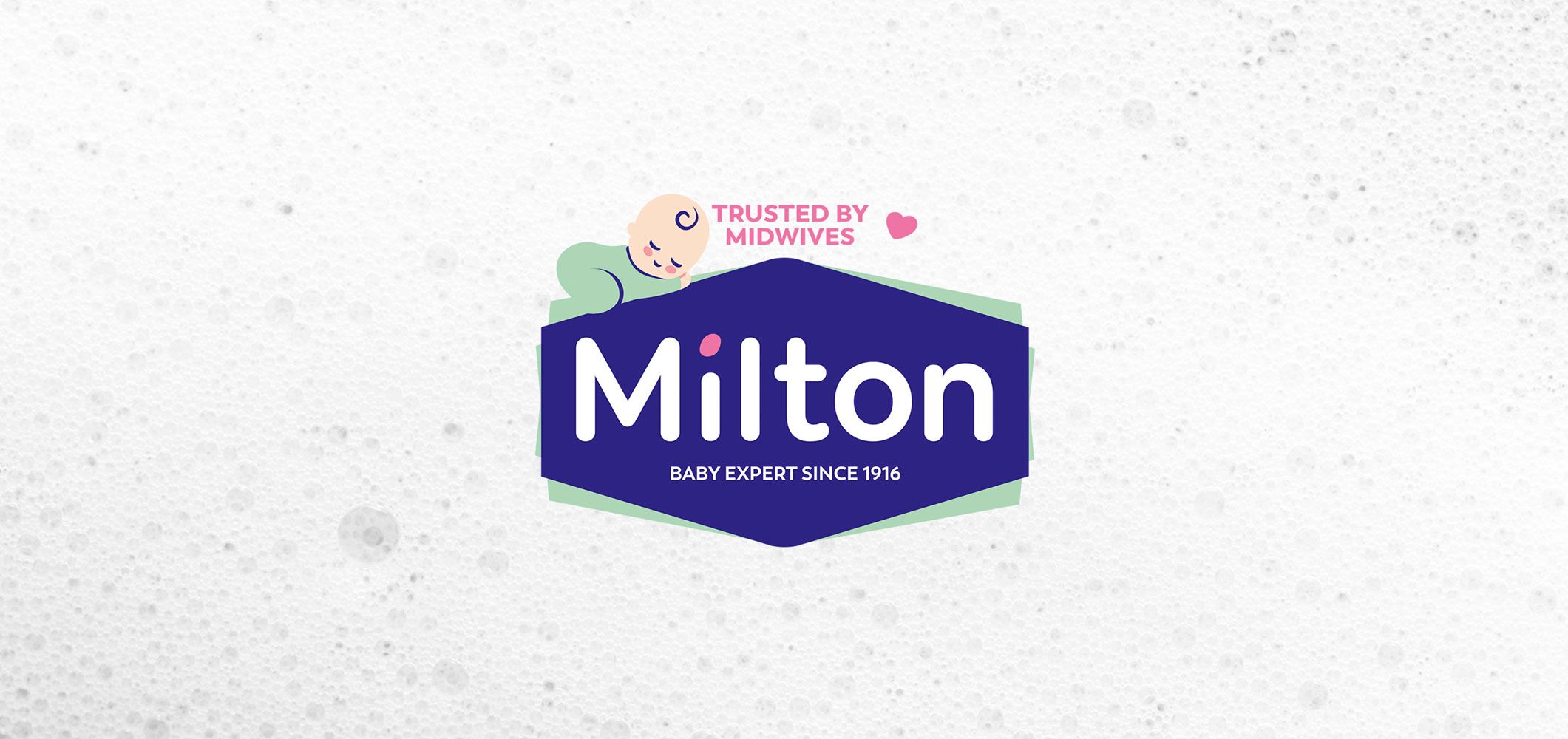
The new created branding is thus the right expression of the positioning: naturality is conveyed by leafs & green color under the shield, expertise is traduced by the reinforcement of brand’s origins thanks to the strong blue shield and the signature « baby expert since 1916 & recommended by midwives », care is conveyed by the smooth pink heart, soft font and pink and green pastels.
You’ll notice that the branding adapts to its market : focused more on naturality for France & Australia, and on baby expertise for the UK and Ireland.
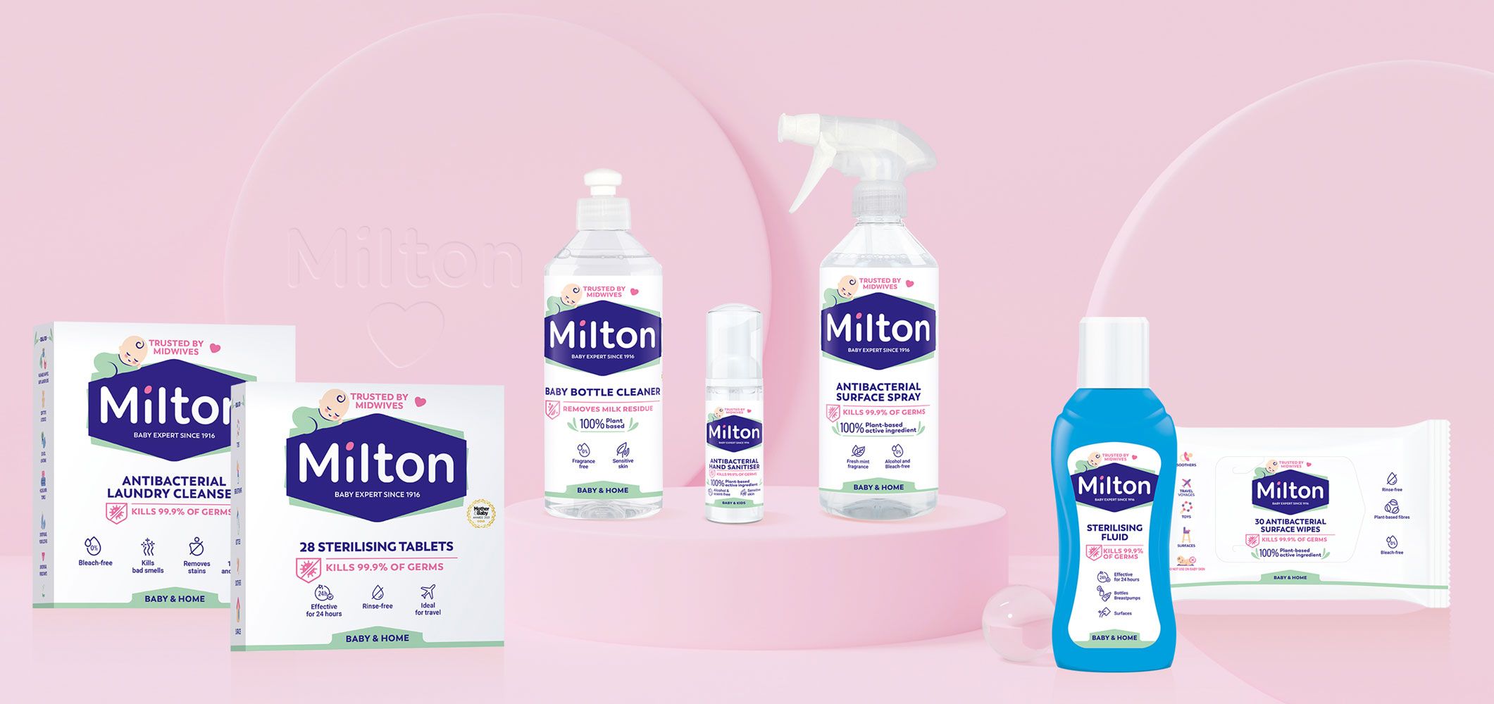
Branding takes now 40% of the space to consolidate the new brand identity.
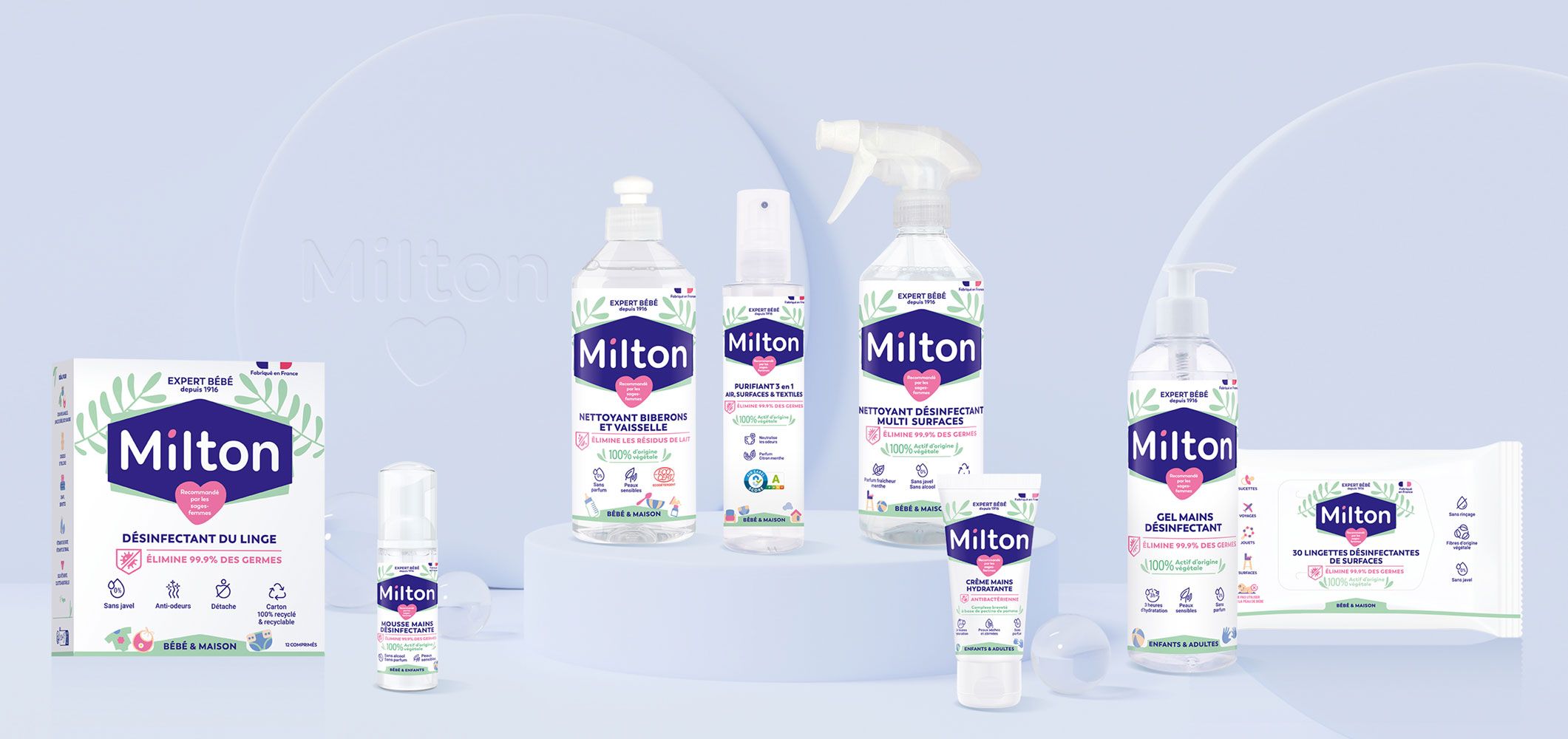
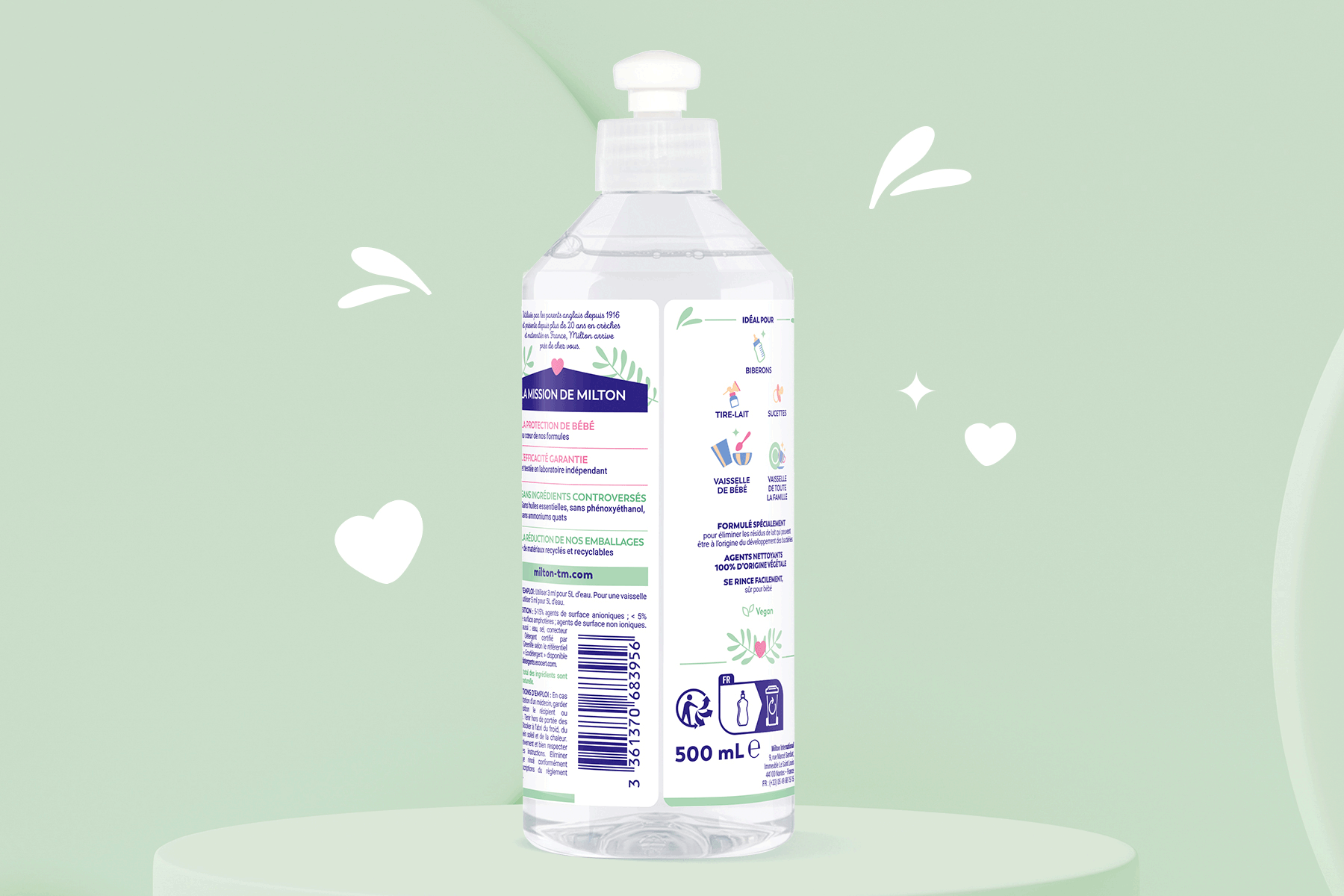
Packagings always keep 60% of white to ensure the cleanliness and hygiene side of the brand image. Into that white space, we simplified, reorganized & homogenized clearly the claims and structure of the 15 products. Simple & product's benefits oriented icons represent the efficiency of the products.
The category is displayed at the bottom and illustrated by naive but efficient icons from the baby world. These Pictograms & baby graphic universes all around the packaging create a joyful & living baby brand punctuated by touches of efficiency & naturality for a subtle balanced result.