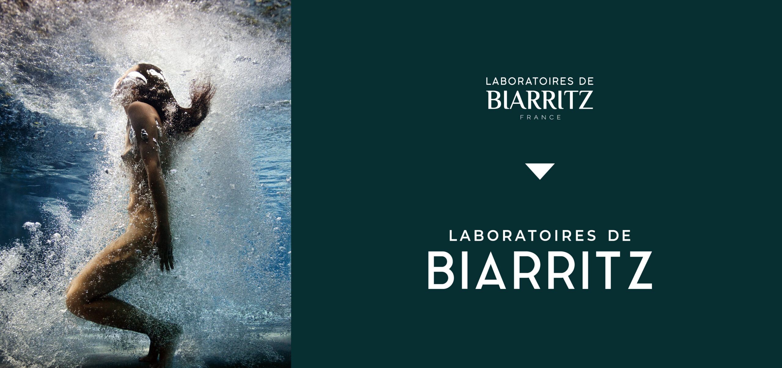
BRAND REVAMP
LABORATOIRES DE BIARRITZ
Sun & Skincare brand revamp
POSITIONING, BRANDING, GRAPHIC DESIGN, ICONS, ILLUSTRATIONS
Following the communication launch of the brand, KIMBRANDESIGN was asked
to work on the branding & the various packaging ranges for a national and international relaunch of the brand.
Our goals were:
-improve clarity and understanding of the in-store offering from the Logo’s visibility to the products image
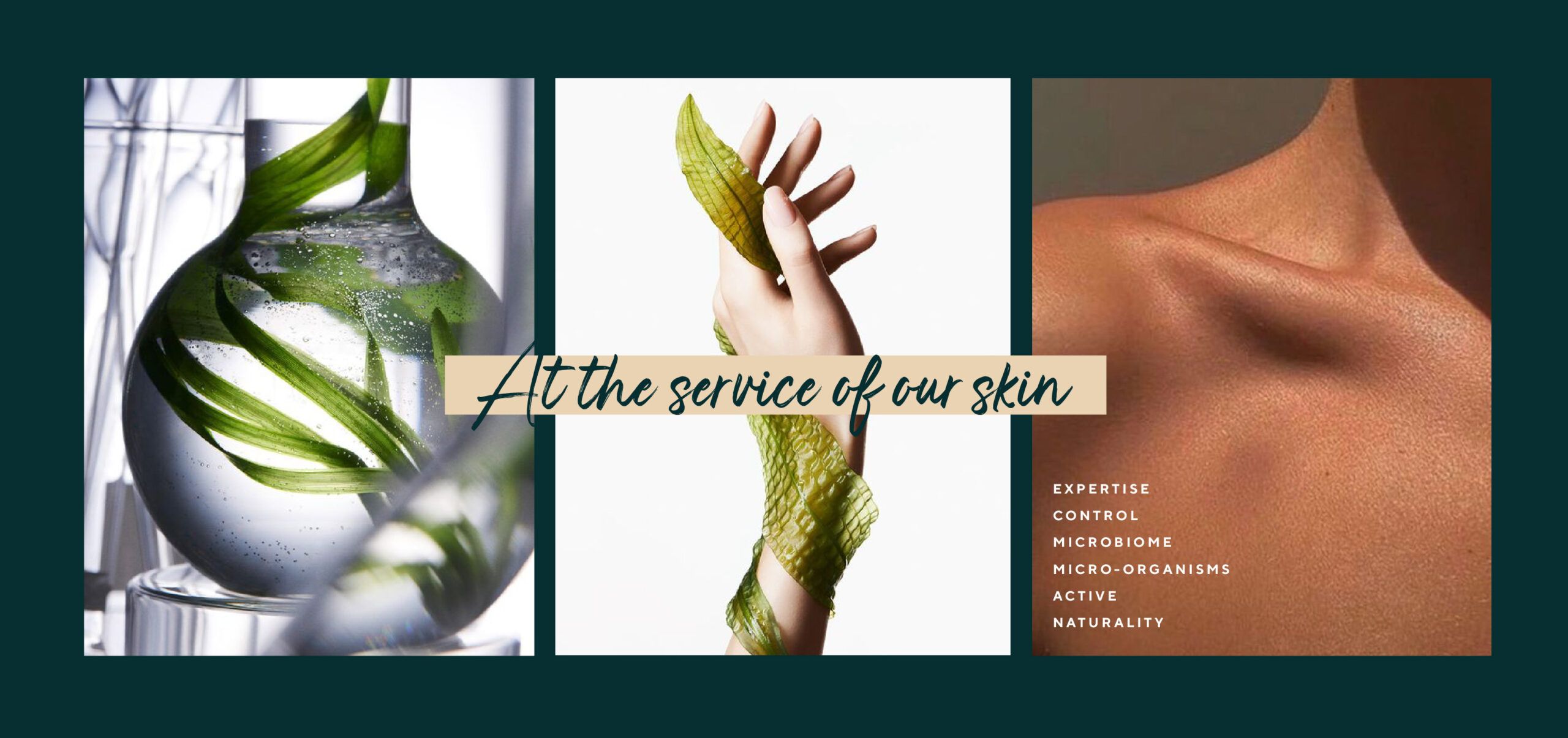
-convey the strong LDB identity, the brand’s dual commitment : skin & ocean
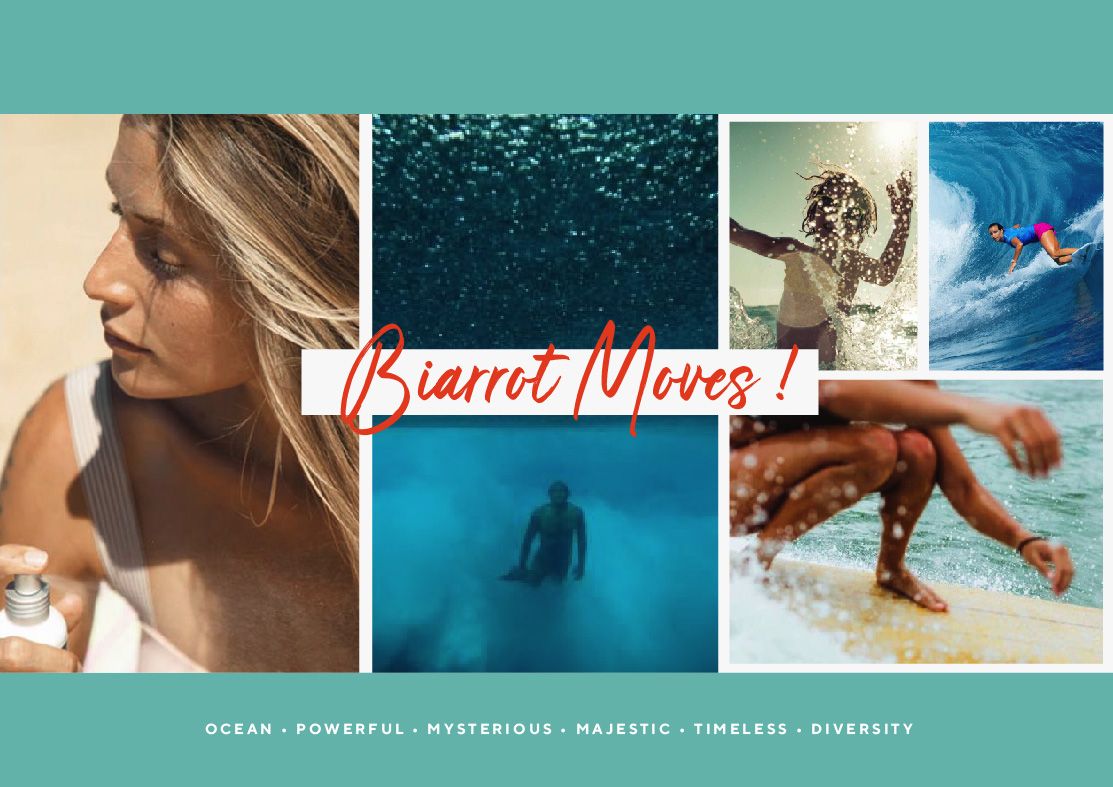
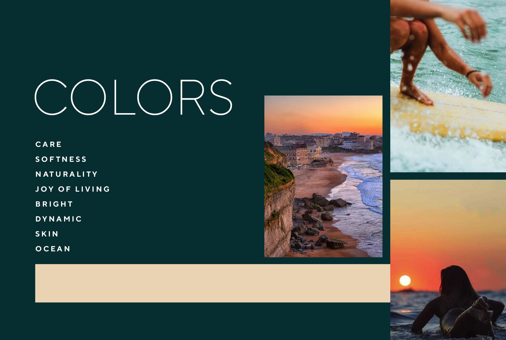
-embody the Biarrot spirit & increase in desirability and lifestyle
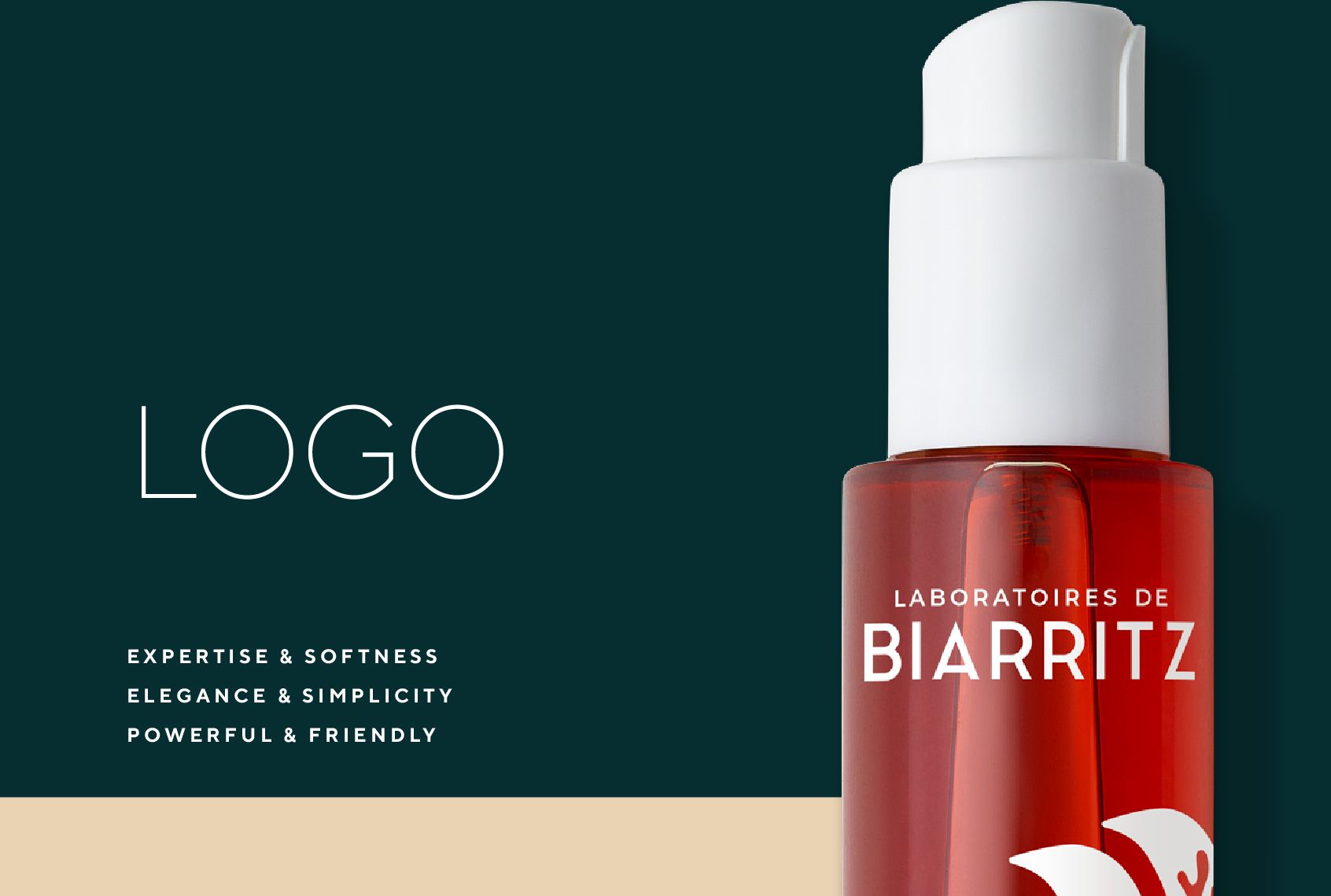
Through the design of the new Logo, we bring more stature and elegance thanks to high and straight letters.
The sharp angles also structures and anchors the logo.
To convey the conviviality and smoothness of the brand we have accentuated the curves of the letters « B » and « R ».
The logo signs a more assertive and confident personality. « Biarritz » is in the spotlight.
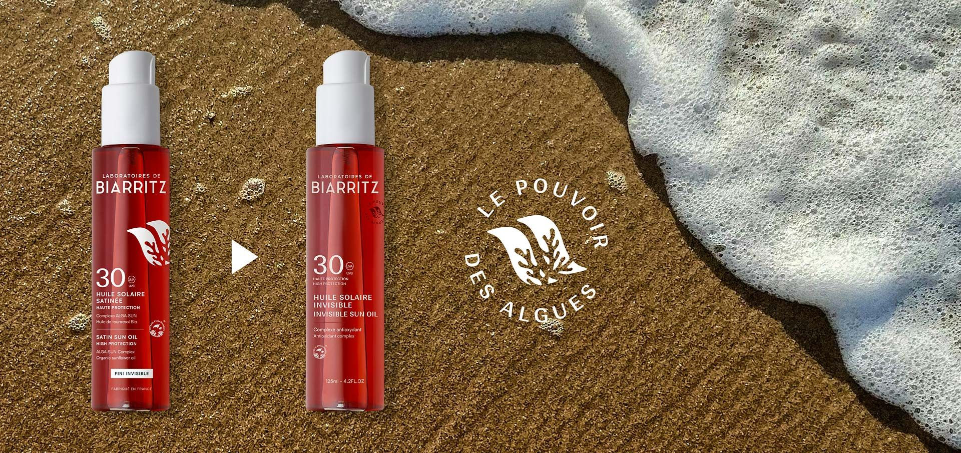
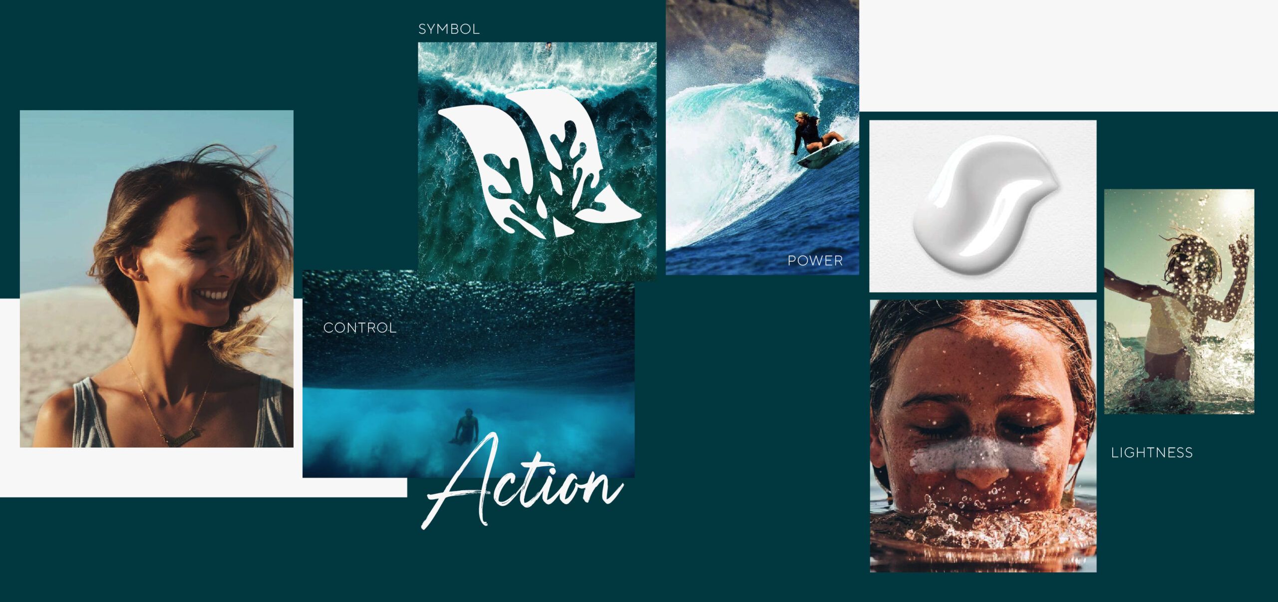
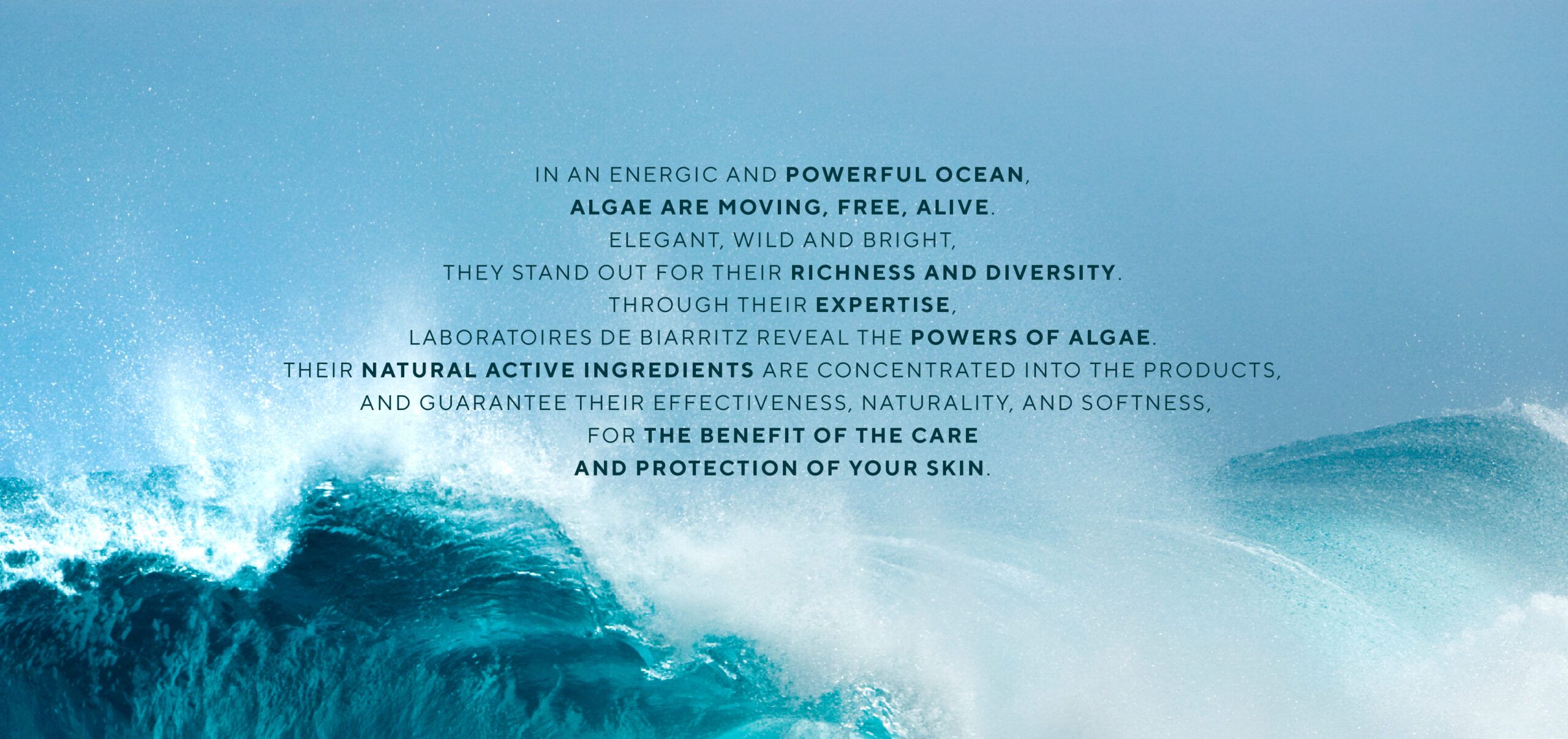
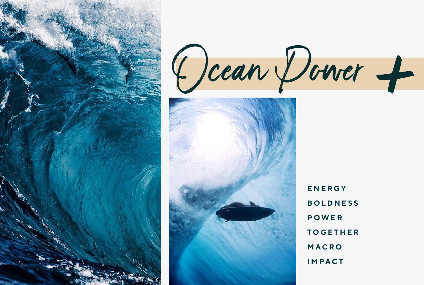
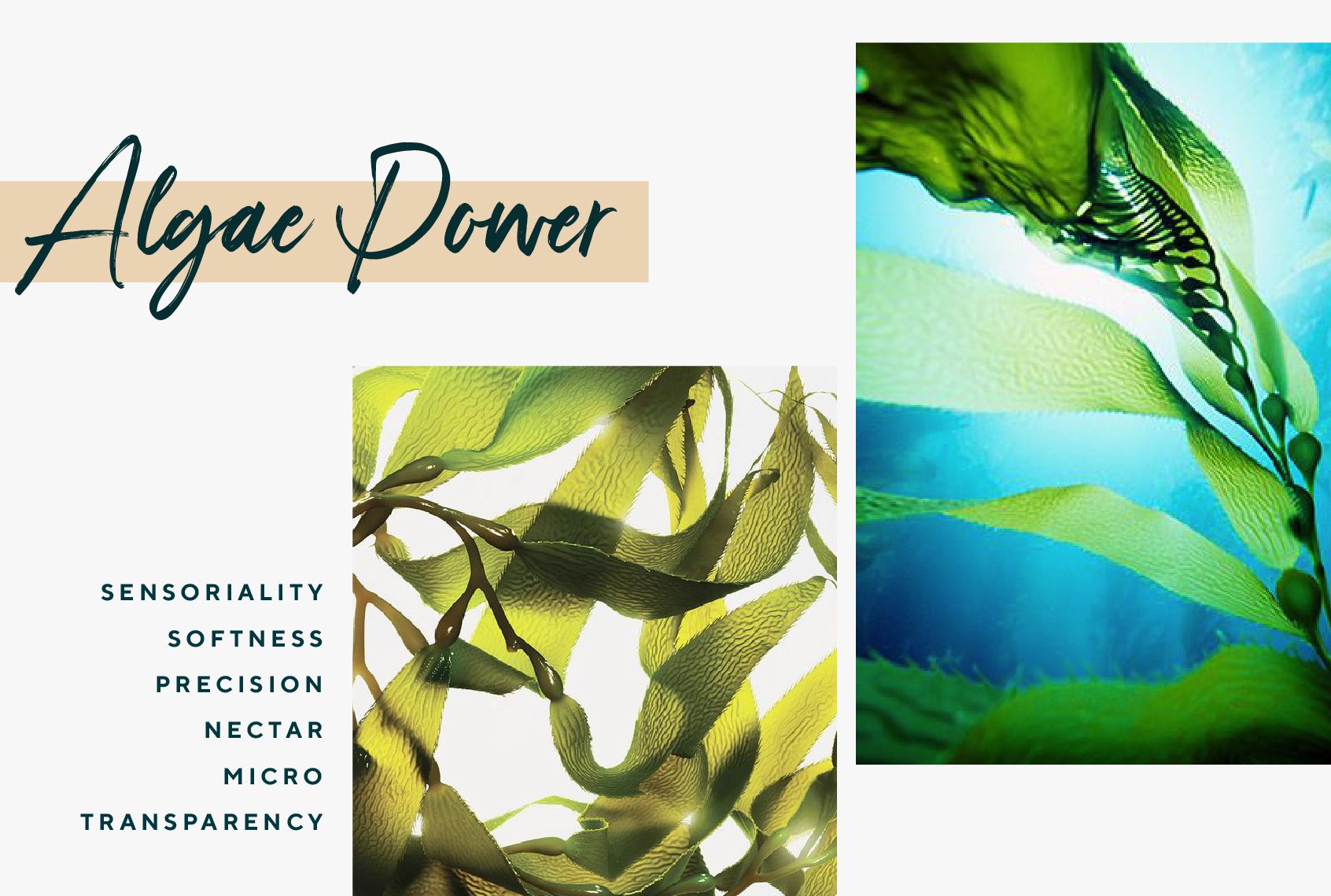
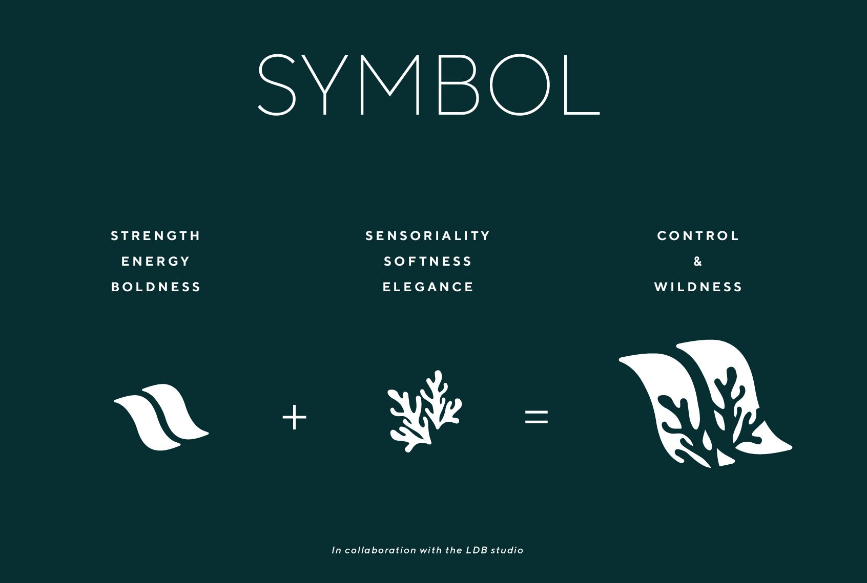
Supported by the brand’s graphic team, we strengthened the skin & ocean positioning through the design of a new powerful identity symbol.
This unique Laboratoires de Biarritz symbol combines the power of the ocean with the power of algae.
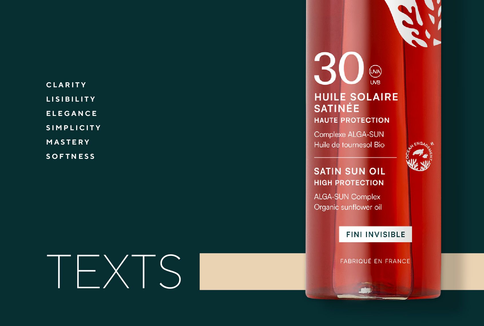
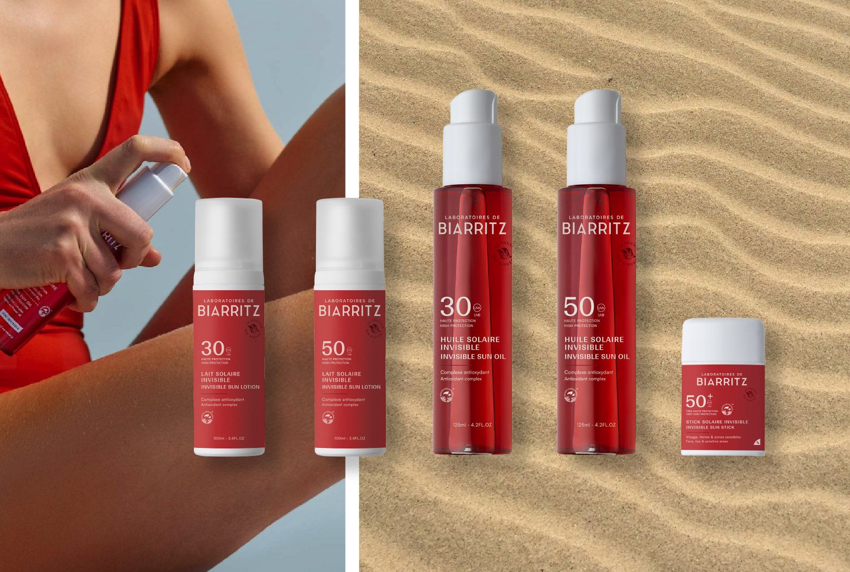
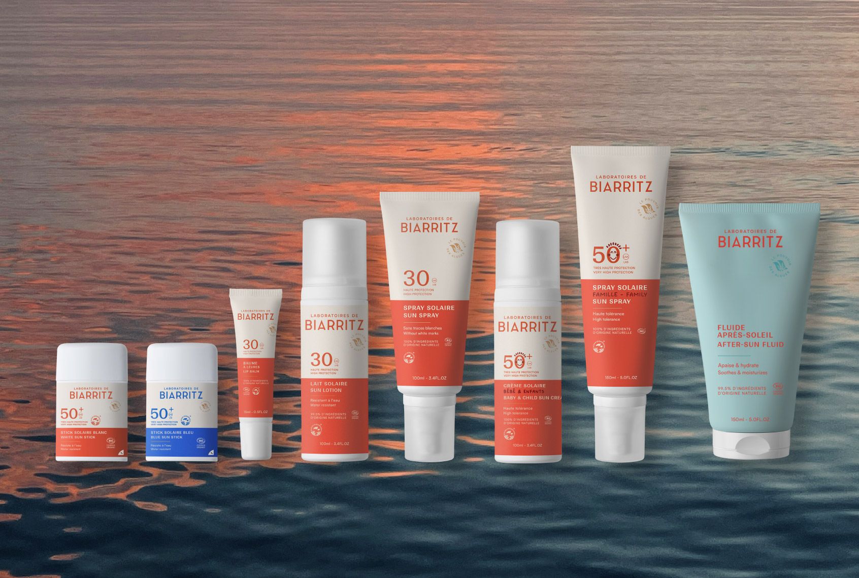
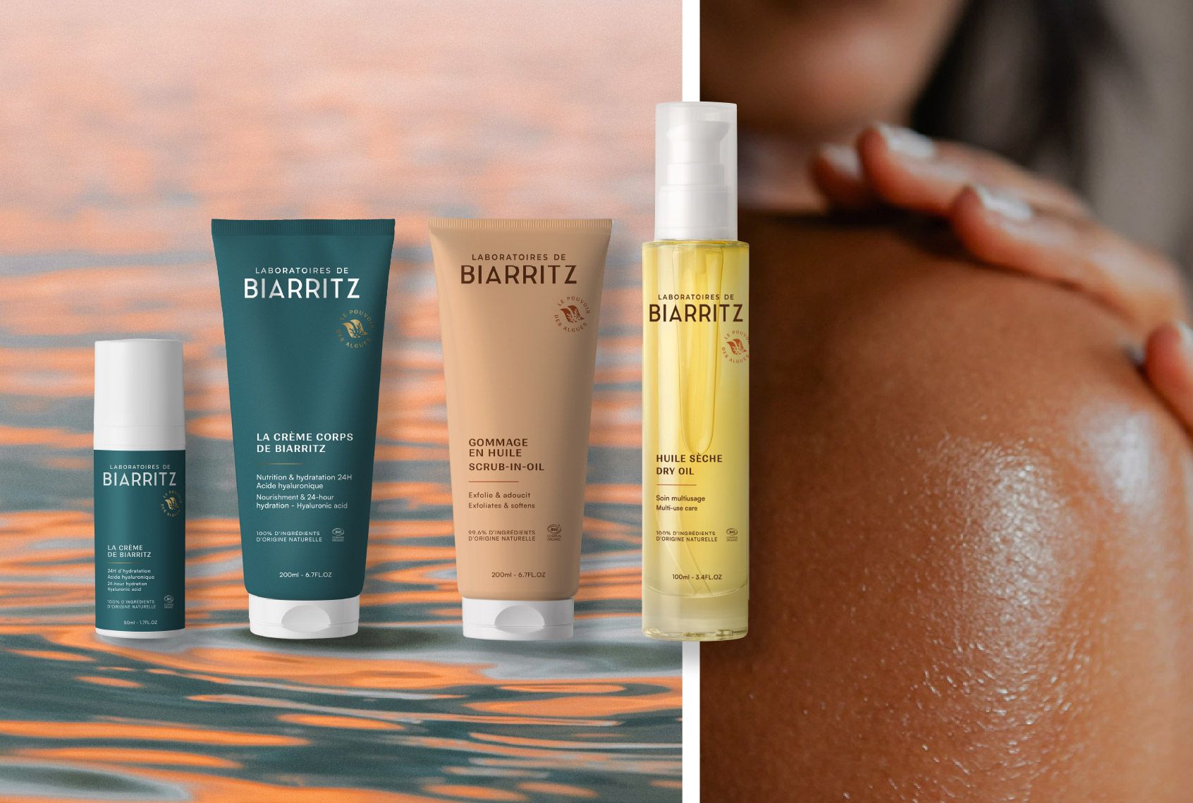
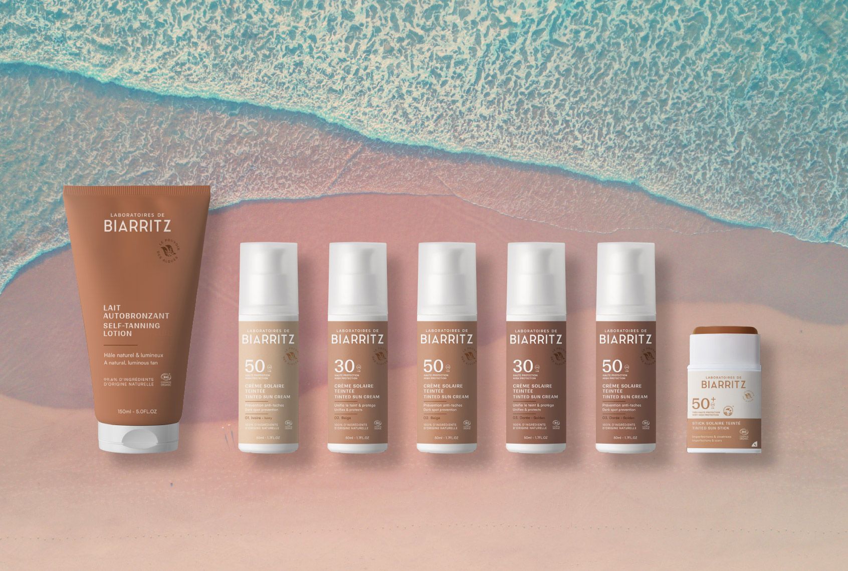
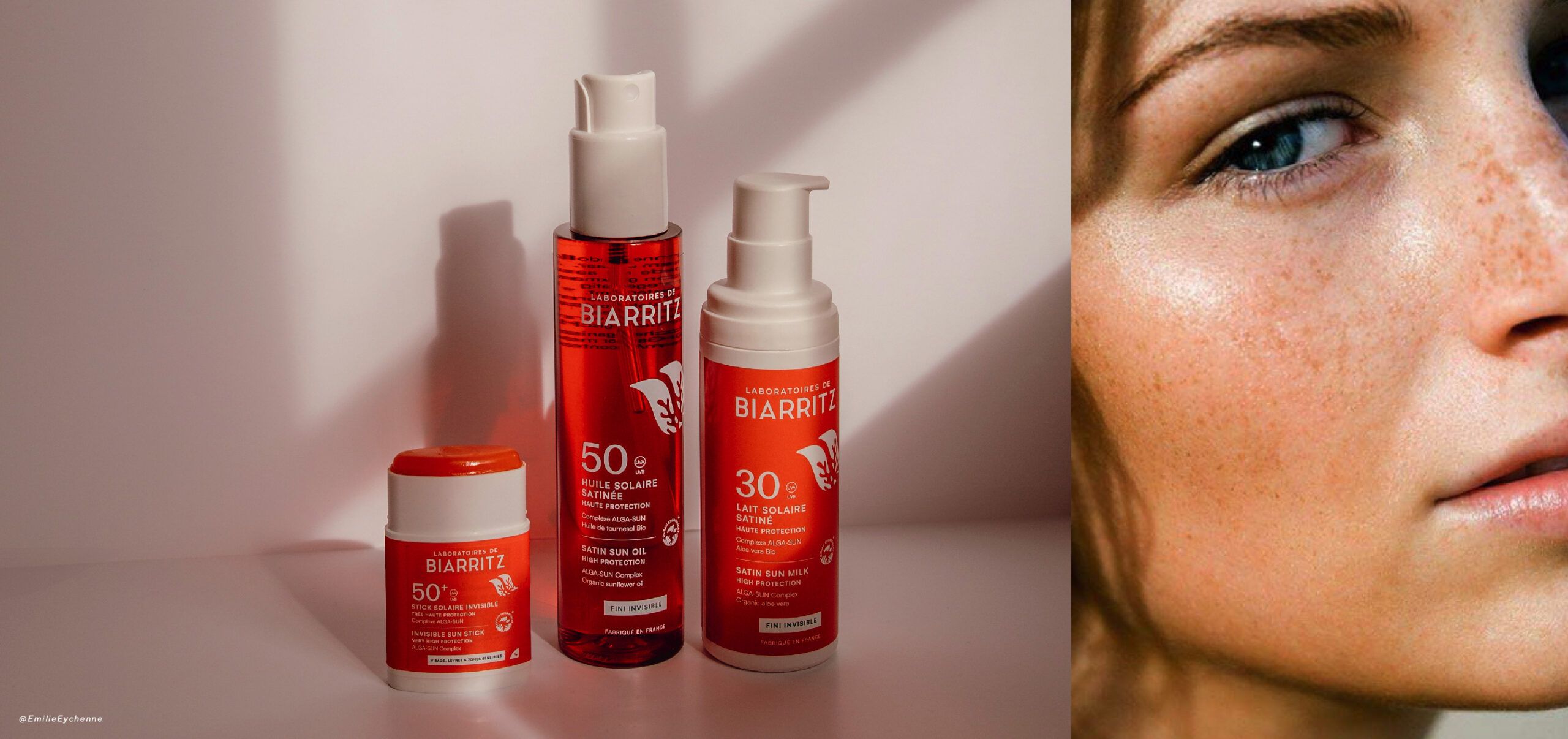
Through the packaging design, the idea was to be straight to the point, be simple in the words used and also efficient.
Through a global teamwork, we reorganized and simplified the messages to get the essence of the product directly.
The sun range below is the first to be launched from multiple ranges (approx 70 products).
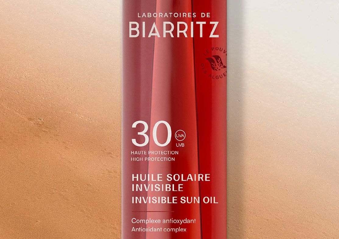
After conducting the initial tests on the Sun range, we made some slight graphic adjustments :
To further emphasize the concept around the identity symbol we wrote the "power of algae »
To strengthen the premium aspect of the brand, we reduced the symbol to make it as a signature and optimized the layout of the text on the packaging.