BRAND REVAMP
FEMFRESH
INTIMATE SKINCARE BRAND REVAMP
POSITIONING, BRANDING, GRAPHIC DESIGN, COMMUNICATION, MERCHANDISING, ILLUSTRATIONS, ADAPTATIONS, ICONS, GUIDELINES
Femfresh is the global market leader of the Feminine Hygiene category in UK and Australia. « Gentle Freshness » embodies this new positioning. Our mission was to bring to life this new brand positioning, modernize packaging design appeal & clarify range navigation.
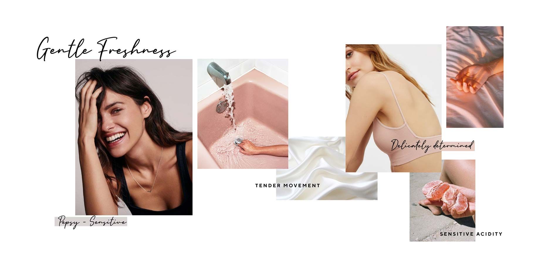
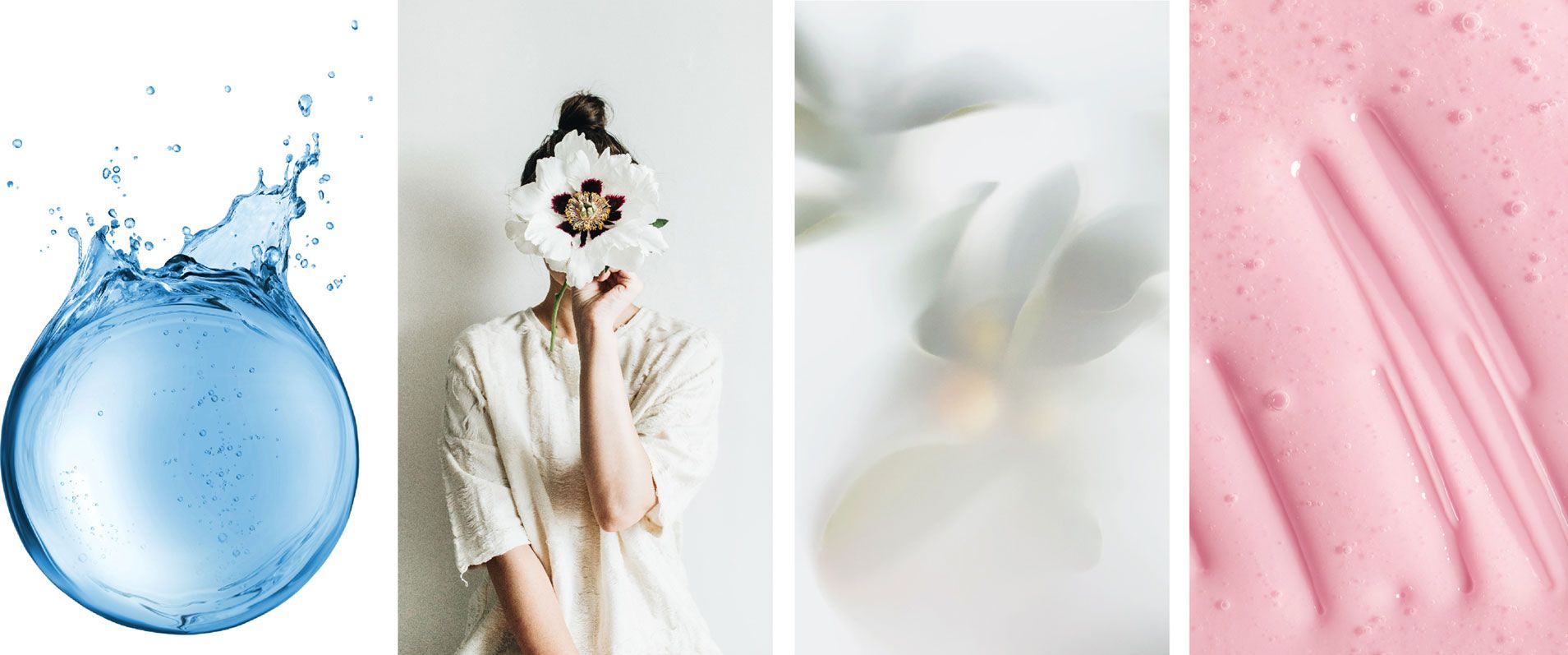
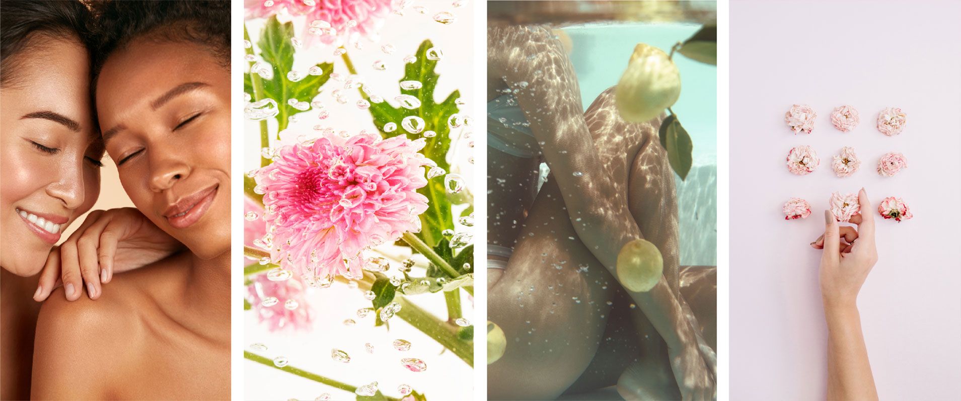
Considering these intentions, we conceptualized “Gentle Freshness” starting from words to images. We traduced the brand personality: a modern active woman who cares about her intimate and overall health.
The leading idea was to follow a soft-active design approach to reach the right brand direction. From the branding to the graphic roll-out of the full range, we combined care with dynamism: smooth shapes with energetic patterns, vibrant pastels colours, friendly organized structures.
The branding evolved from a black hard rectangle to a white gentle bubble. The opaque colored splash behind the rectangle changed to a transparent blue watersplash around the bubble. This fresh active-delicate watersplash is now the signature of femfresh. It stays the same everywhere to keep global consistency. On the contrary, the bubble changes slightly from one reference to another, integrating the color variant as a soft gradient to enhance the specificity of each reference. At the top of the splash, the pictogram pH & microbiome balanced strengthen the brand indicating the products’ benefits & reliability.
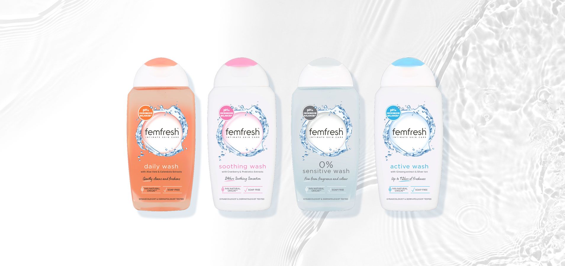
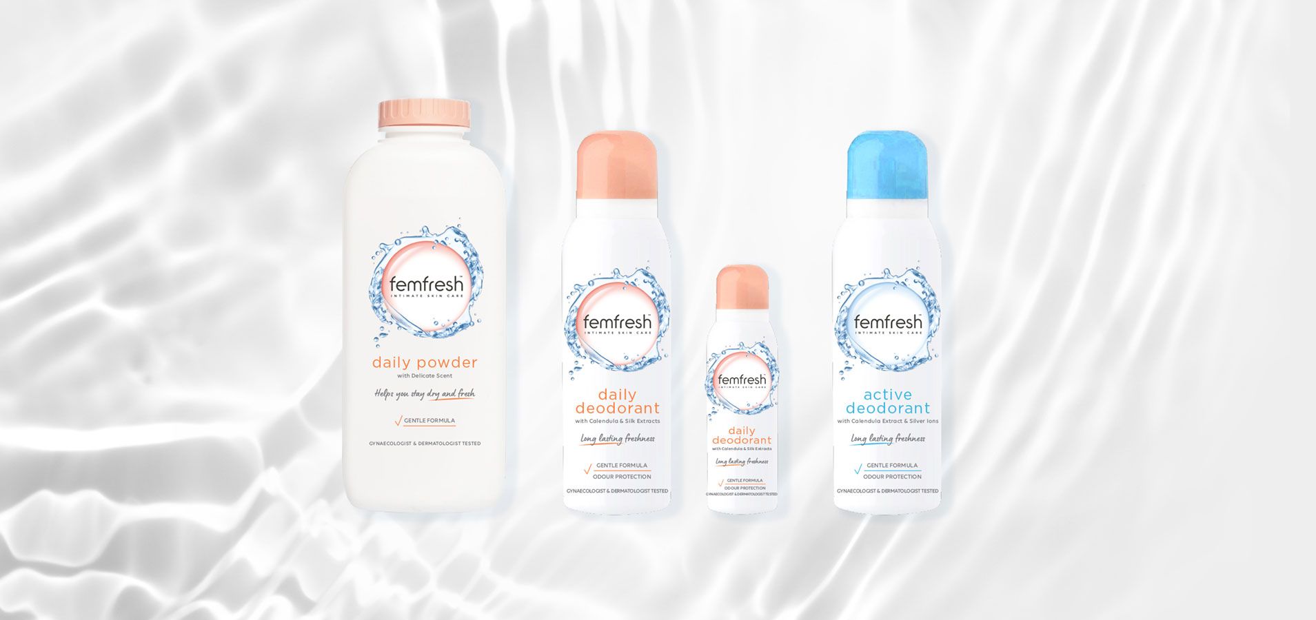
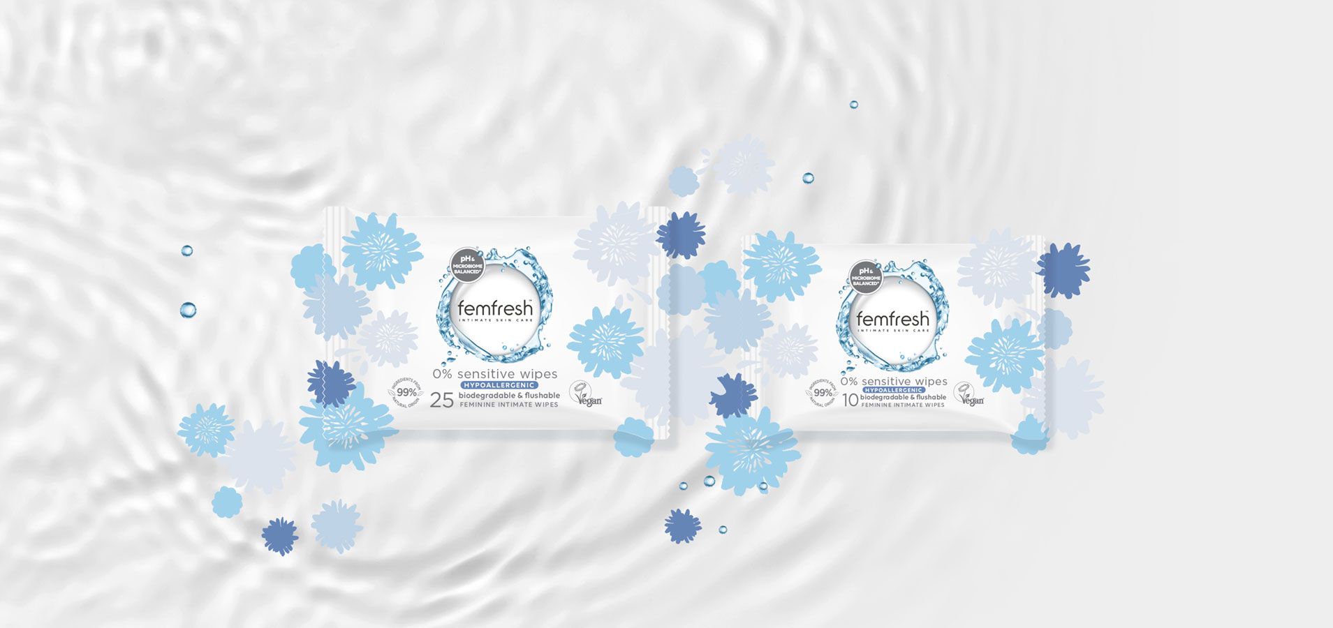
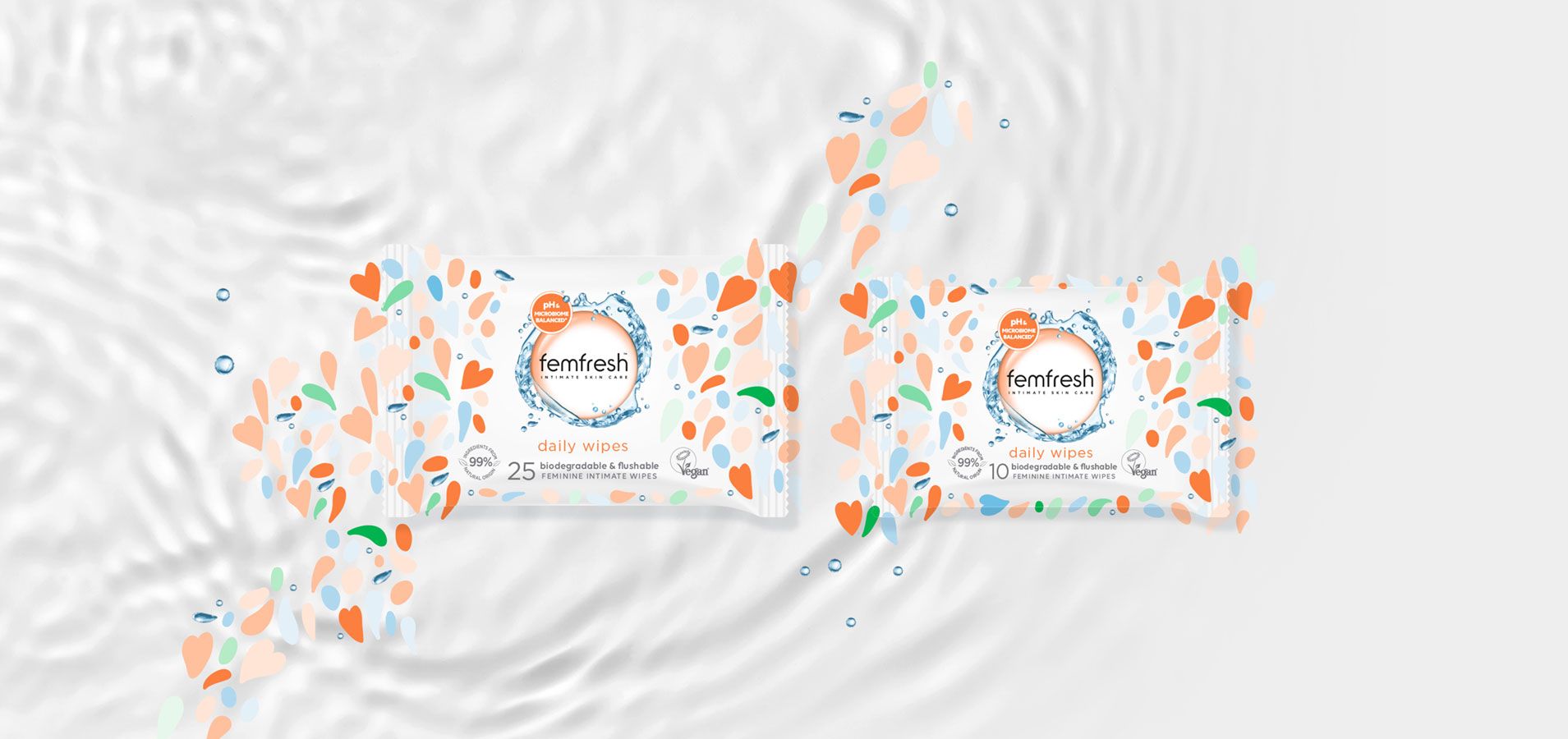
Graphic design of all packaging of the brand (showers, sprays, wipes, powder) were developed to be clean & simple within this idea of freshness and gentleness. We chose precise and short words using script warm fonts combined to structured serious ones. We organized the information following the “less is more” idea and created attractive pictograms to help readability. Claims such as 0%, Hypoallergenic, 99% ingredients from natural origin and vegan showed the importance of a clean and natural perspective. Femfresh's new brand identity can now freshen in a gentle way shelves from all countries!
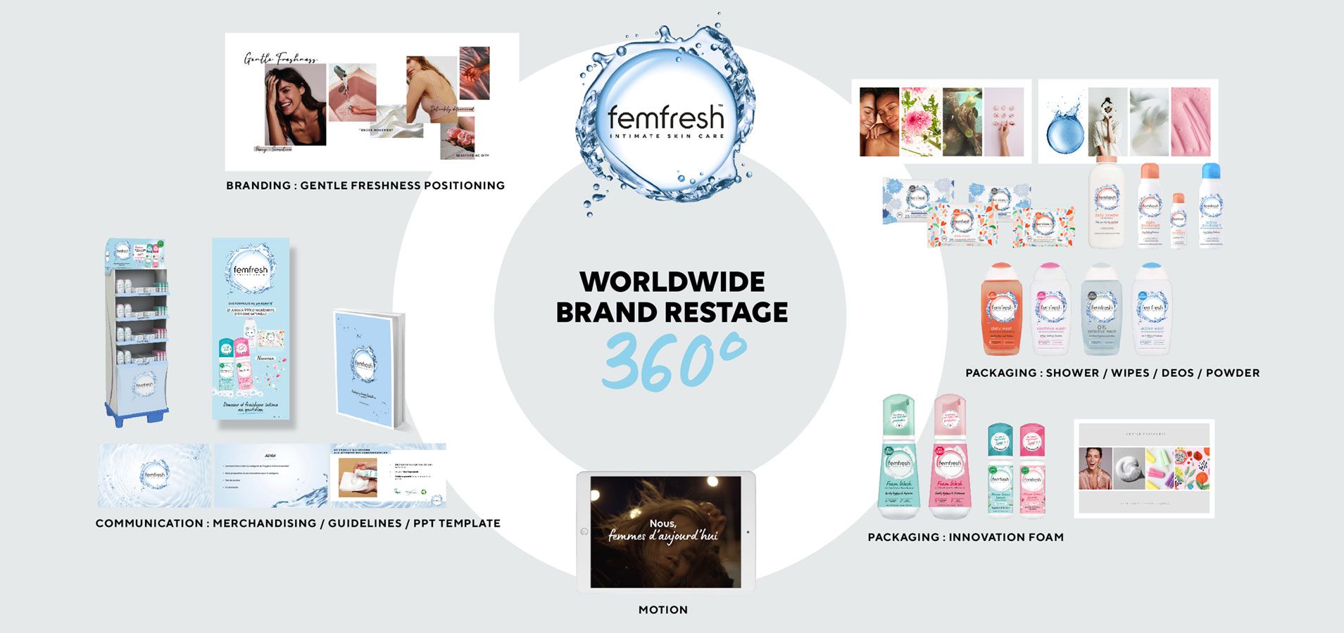
Following the branding creation and the packaging designs, we developed all the communication tools around the concept : from the motion design to the posters and merchandising tools. We also built guidelines to structure the design and bring a useful guide to the femfresh teams.
Thanks to this colorful caring range, we helped femfresh to bring joy, sensoriality and fun
into a category which needed mordernity freshness and hedonism!
We are integrating here a new movement where women are revendicating proudly their intimacy!