DESIGN PACKAGING
DANIEL JOUVANCE
Skincare Range Revamp
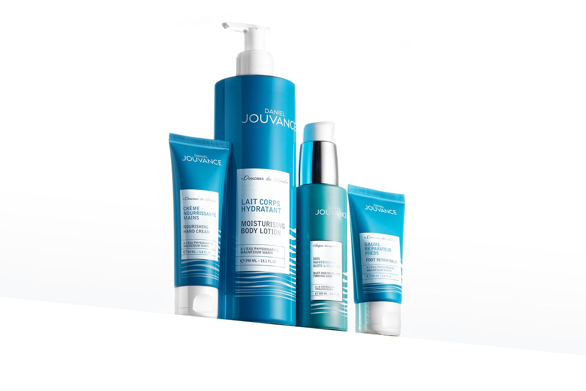
GRAPHIC DESIGN, LOGOTYPE, ADAPTATION, ICONS. Ocean was our first priority in this new skincare range. The idea was to come back to the roots of the brand, the Ocean. We creatively worked on how to express ocean beauty combining sustainibility and visibilty. We created a feeling of calm & relaxation. Thanks to an abstract, simple and prestige design, we could feel the expertise and sensorial effect of the creation. The subtle waves of the ocean revealed through the packaging represent the brand signature.


